


ABC Tarps serves customers looking for covers for quite different jobs, from boats and caravans to sporting and agricultural uses. The identity needed to feel recognisable across that range, without losing its connection to the product or making each category feel like a separate brand.
The brief: refresh the ABC Tarps identity and create a consistent look that could work across its broad product range and marketing materials.
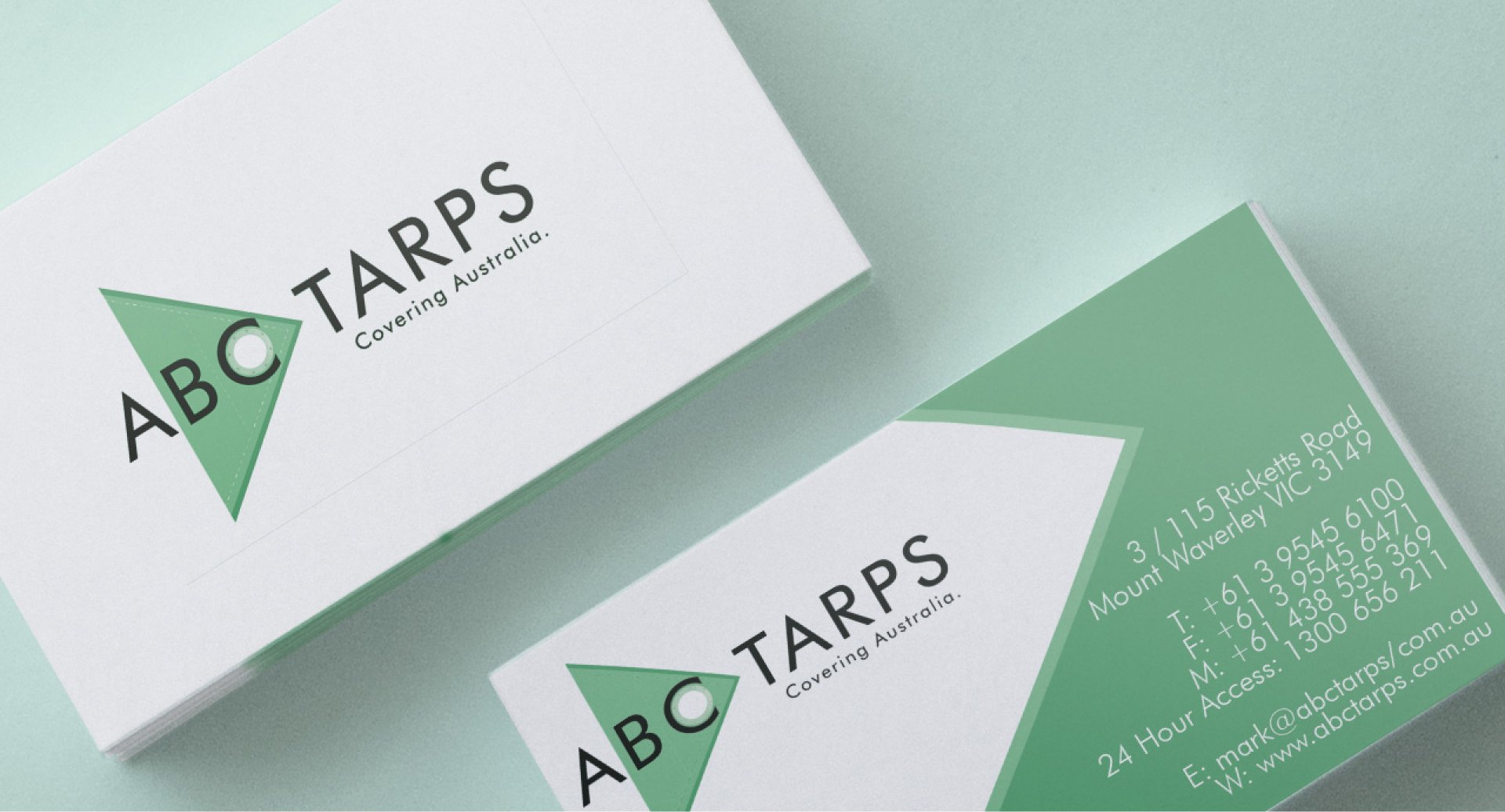
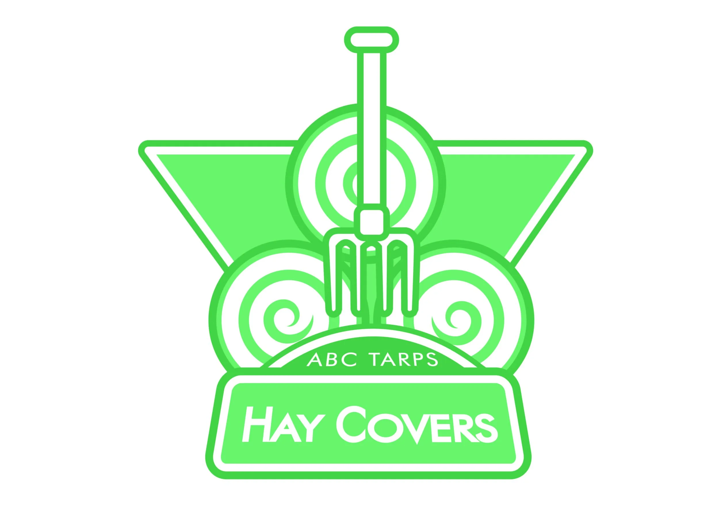
My approach: I took inspiration from the product itself, using the corner of a tarpaulin and its eyelet as the starting point for the logo. A bright green palette gave the identity a distinctive look, which I carried through to printed collateral, social assets and website imagery. I also developed logo variations for specific product categories.
The result: a core identity supported by a set of product-specific logos, giving ABC Tarps a consistent visual language across its different ranges and marketing materials.
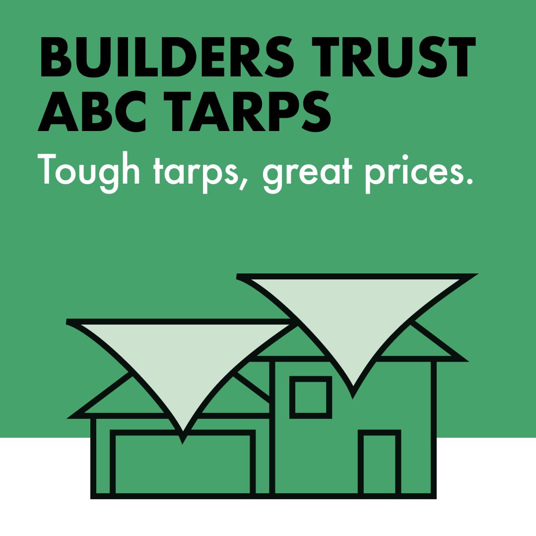



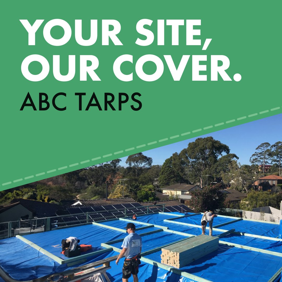
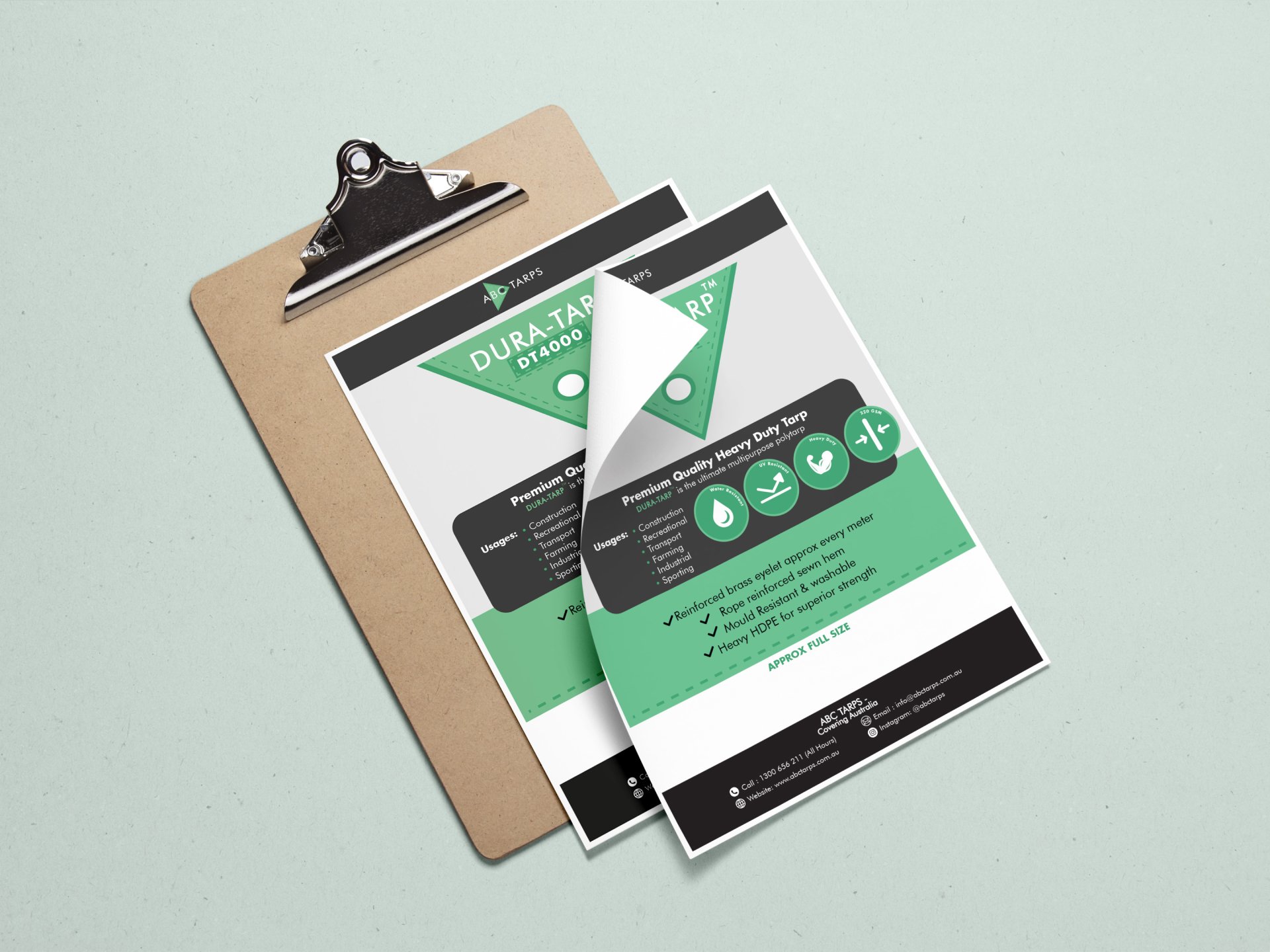
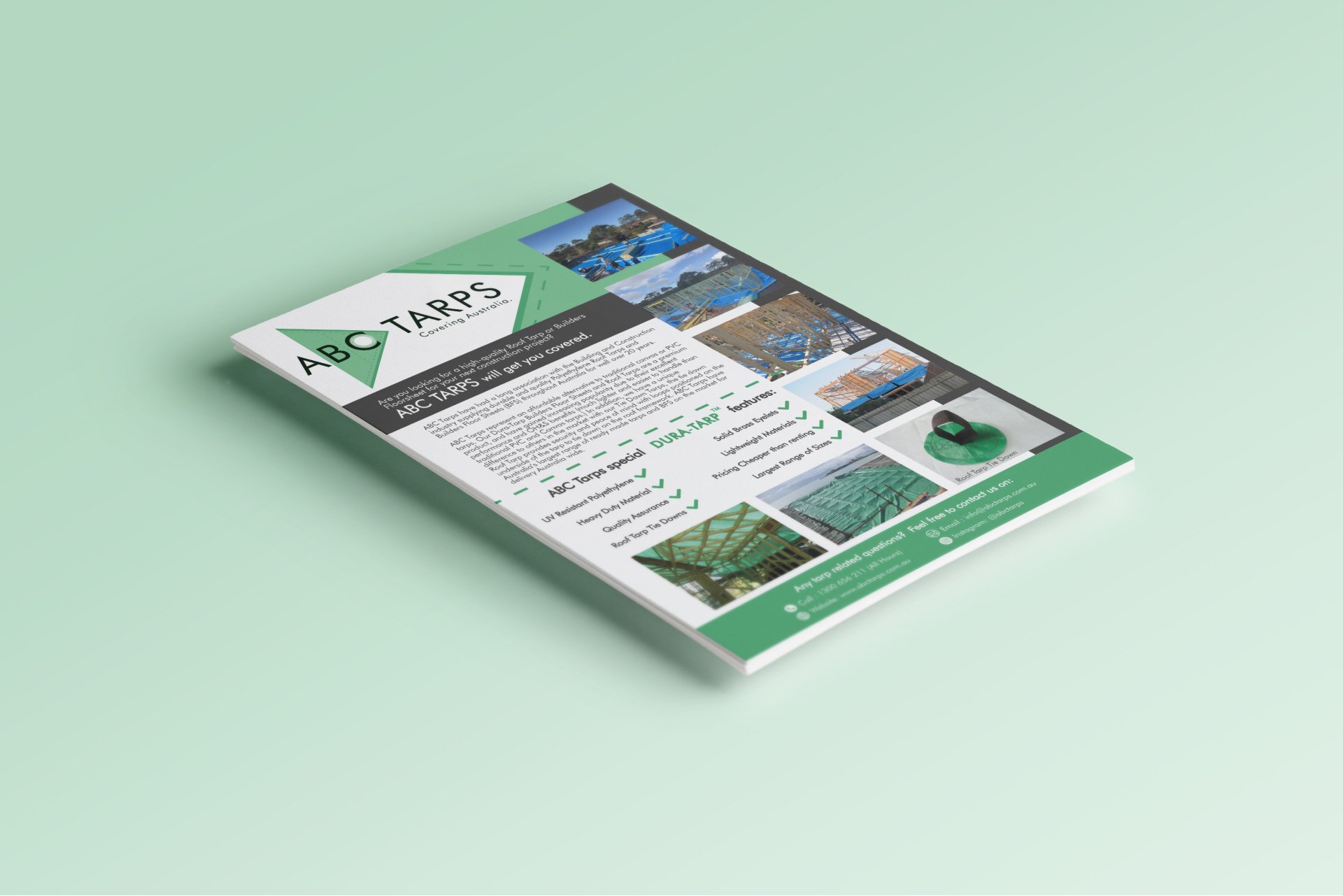




See the identity in use on the ABC Tarps website.
Next project